Difference between revisions of "3.6 KPI Chart"
| Line 5: | Line 5: | ||
* Using this worker can review their own workability performance over State Level. It displays the following bar graphs, | * Using this worker can review their own workability performance over State Level. It displays the following bar graphs, | ||
| − | + | Collections on Current Support | |
| − | + | Collection on Arrears | |
| − | + | Paternity Establishment | |
| − | + | Support Establishment | |
* It displays bar graph to review the logged-in workers performance across state level. | * It displays bar graph to review the logged-in workers performance across state level. | ||
Revision as of 06:09, 6 January 2015
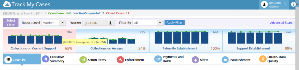
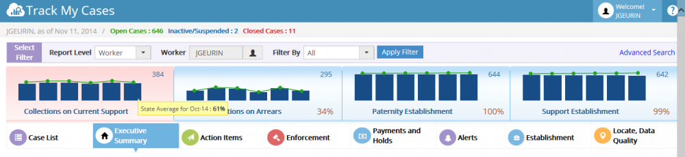
KPI Chart:
- Using this worker can review their own workability performance over State Level. It displays the following bar graphs,
Collections on Current Support Collection on Arrears Paternity Establishment Support Establishment
- It displays bar graph to review the logged-in workers performance across state level.
- The green color trend line shows logged-in worker’s performance. Node displays the percentage over state level.
- The blue color bar graph shows State Level average results.